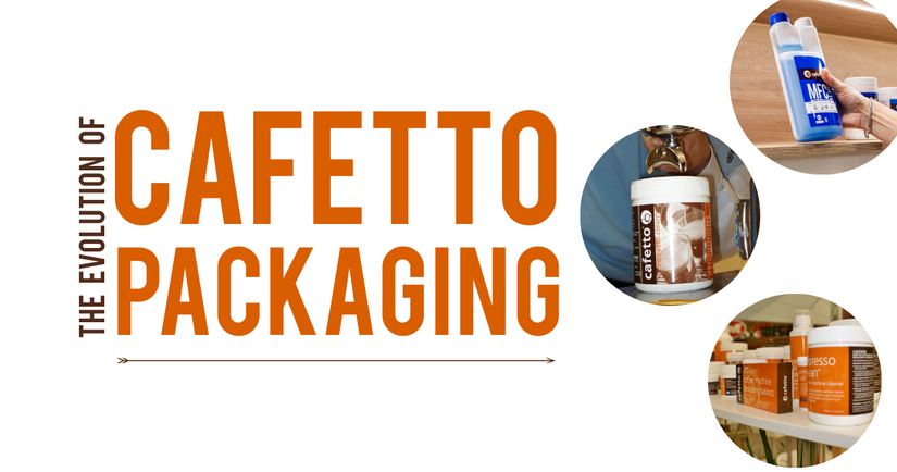
22 Years of Coffee, Packaging, and Memories. 📸
After 22 years in the coffee world, we've witnessed quite a bit - trends that spark and fade, champions who put their nations firmly on the coffee map, and an industry that’s grown beyond imagination. Yet, nothing ever stops us in our tracks quite like opening the vault and diving into the Cafetto packaging archives. Buckle up, it’s time to go #WayBackWhen.
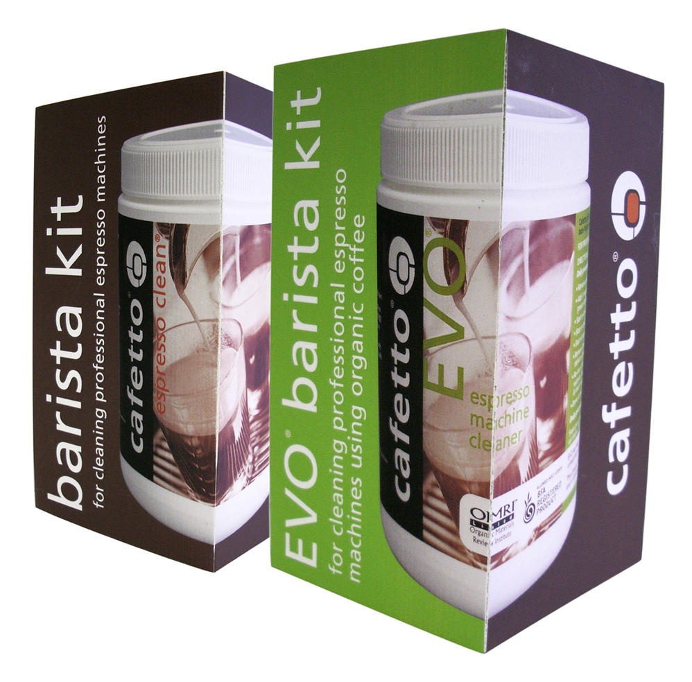
2005: Evo & Espresso Clean - when more meets more. 📦
The brand was just two years old, and the design? Unapologetically of its time. Labels featured coffee machines pulling shots against warm, faded brown tones - classic, comforting, and unmistakably “coffee.” The green outer boxes practically shouted off the shelf. Rich colours, literal imagery, and a focus on telling exactly what the product did at first glance. 2005 was an era when more really was more.
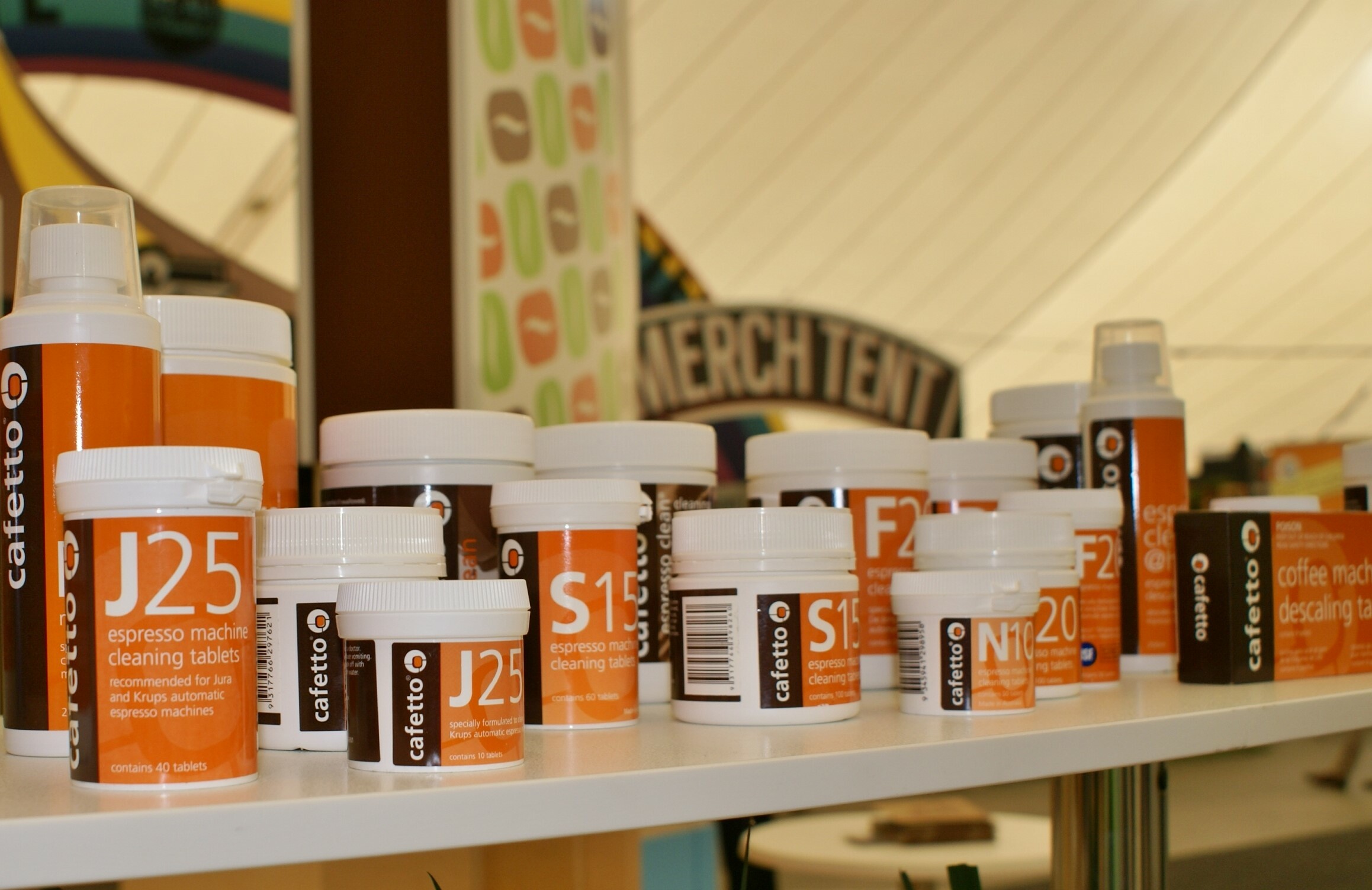
2012: Orange you glad we did this? The rise of the bright jars. 🍊
Spot a few familiar faces? J25, S15, N10, and F20 came dressed to impress in signature bright orange jars. Impossible to ignore (especially at tradeshows), the era favoured vibrant, energetic packaging, clean typography, and a move toward contemporary, approachable designs. Compared to 2005, Cafetto had gone sleek, louder, and bolder - a reflection of an industry embracing minimalism with punch.
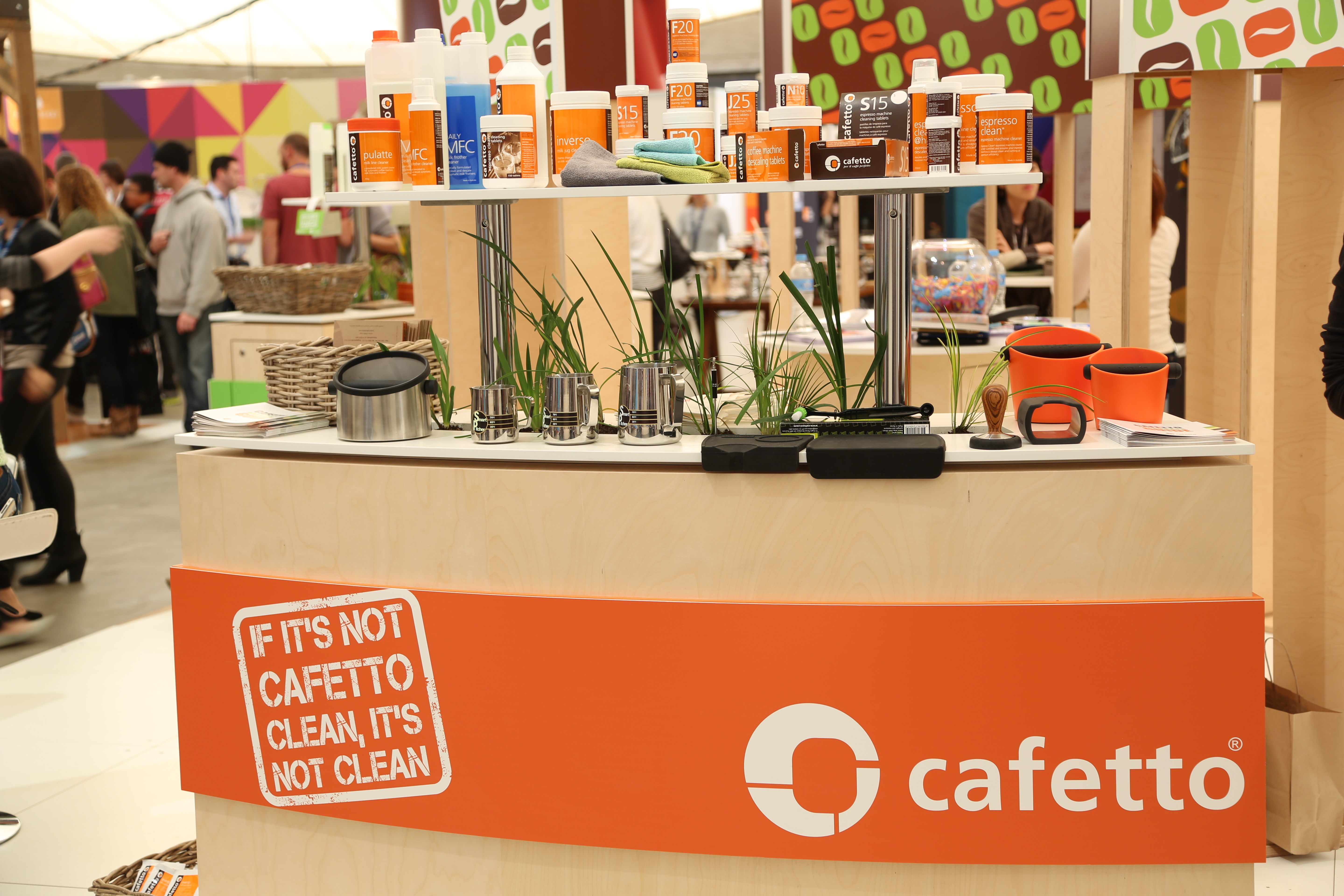
2013: Curves, colour, and tradeshow tales. 🏪
Looking back at 2013, the tradeshow floor was full of energy and colour. The orange labels and bold designs gave everything a punch, while the curves in the stand echoed the Cafetto logo - a subtle nod to brand identity in the middle of all the hustle. Vibrant, bold, and unmistakably of its era, these moments are the kind of memories that make you smile and remind us how far we’ve come.
2025: The Cafetto packaging evolution. ☕
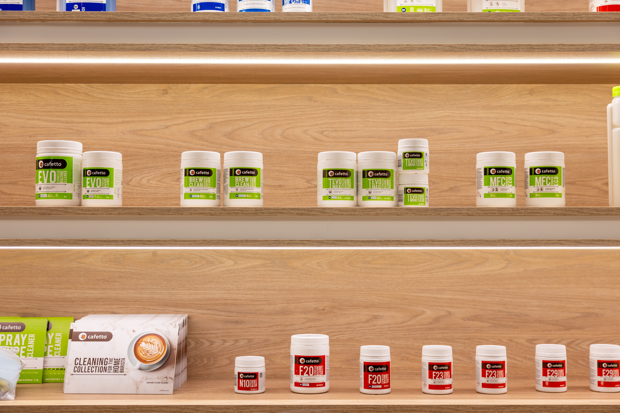
Fast forward to today, bold colours are still doing the heavy lifting, but it focuses on usability. It’s easier than ever to spot the difference between alkaline and acidic products - because when it comes to looking after your machine, the small details matter. Every label, every box, every curve is designed with clarity, purpose, and just enough character to make sure Cafetto stands out, proving that good design isn’t just about looking great, it’s about making life a little easier too.
Ready to add a splash of clean to your next cup? Click here. 👈

